


5 Costly Mistakes in Escape Room Website UX and How To Avoid Them

Welcome to the ultimate guide for mastering website UX while avoiding costly UX mistakes in escape room websites.
If you own or work for an escape room business, you're exactly in the right place! We're here to shed light on something crucial to make your escape room shine like the brightest star in the sky!
You know how important it is to have a website that rocks, right? It's not just a digital space but the doorway to the adventures you offer.
But here's the thing, my dear friend! If your website isn't user-friendly, you're missing out on customers and cash. That's where we come in!
In this post, we'll uncover 5 costly mistakes in escape room website UX that could be hurting your bookings and online presence.
Your escape room website isn't just for show — it's about easy navigation and booking. A bad user experience can drive visitors away. But a great one? It turns clicks into bookings instantly!
And that's what we're here to help you with!
We're not just here to find issues but to fix them! Soon, you'll master website excellence and attract more adventurers.
So, roll up your sleeves and dive into the journey to avoid common UX mistakes in escape room websites.
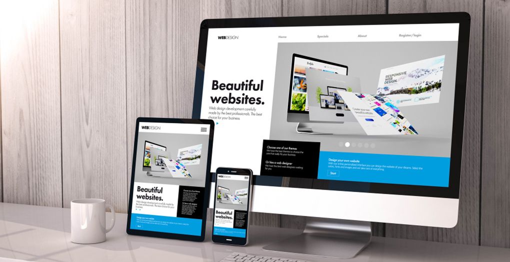
01. Neglecting Mobile Responsiveness
In today's digital era, where mobile devices rule the browsing scene, having a mobile-friendly escape room website is essential. Neglecting it is one of the biggest UX mistakes in escape room websites.
With an increasing number of users accessing the web on mobile devices, overlooking mobile responsiveness is like shutting the door to a huge audience!
Let's explore why mobile-friendly design is crucial, the negative impacts of ignoring it, and practical tips to ensure your escape room website looks fantastic on every screen.
A. Importance of Mobile-Friendly Design in the Current Market
Mobile devices have become universal companions in our daily lives, serving as portals to the digital world at our fingertips.
From browsing social media to shopping online and everything in between, users expect seamless experiences regardless of the device they're using.
Therefore, prioritizing a mobile-friendly design is vital to meet these expectations and keep your escape room website accessible and engaging for users on the move.
B. What Happens if Your Website Isn't Mobile-Friendly
Ignoring mobile responsiveness can have severe consequences for your escape room business. If your website doesn't work well on phones, people will get frustrated and leave.
Imagine someone trying to book an escape room on their phone, but the text is too small, the pictures are weird, and the buttons are hard to tap. They'll likely give up and find an easier website.
In today's competitive world, having a website that doesn't work on mobile is like giving your competitors a free pass to steal your customers.
C. Strategies for Making Your Website Mobile-Friendly
Now that we understand the importance of mobile-friendly design and the risks of neglecting it, let's explore some practical tips to ensure your escape room website shines on every device:
- Choose a Responsive Theme: Pick a theme that's like magic — it adjusts to fit any screen size, making your website look awesome whether it's on a phone, tablet, or computer.
- Prioritize User Experience: Make using your website as easy as playing a game — big buttons, simple menus, and easy booking forms, especially on phones.
- Test Across Devices: Before launching, try out your site on different devices, like trying on shoes. Use tools to check how it looks and ask friends for feedback.
Applying these strategies to your escape room website design ensures a seamless and engaging experience for every visitor, regardless of their device.
02. Cluttered Homepage
Let's discuss another one among the costly mistakes in escape room website UX — A cluttered homepage!
A cluttered homepage is quite similar to a labyrinth without an exit, leaving visitors feeling overwhelmed, disoriented, and ultimately, inclined to abandon ship before they've even begun their journey!

A. Things that Are Responsible for A Cluttered Homepage
Imagine a cluttered homepage — a chaotic mix of information, graphics, and buttons. Instead of inviting engagement, it creates a barrier to conversion.
To illustrate, consider the following unnecessary elements that are responsible for cluttered homepages:
- Excessive Texts: Too much text overwhelms visitors, burying important messages. Keep things short and sweet for a quick understanding of your escape room offerings.
- Overuse of Images and Graphics: Pictures are great, but too many can be overwhelming. Choose your images carefully, and make sure each one adds something important to your page.
- Distracting Animations: Fancy animations might seem fun but can be distracting. Stick to simple transitions that make your site look nice without annoying your visitors.
So, these are the villains driving your visitors away! No matter how attractive your Escape Room Website UI is, if your homepage is cluttered with the things discussed above, all your hard work and efforts will go in vain!
B. Tips for Creating A Clean and Organized Homepage
Now that we've identified the culprits contributing to a cluttered homepage, let's dive into some actionable strategies for creating a clean and organized digital sanctuary for your visitors:
- Simplify Navigation: Make it easy for visitors to find their way around your site. Keep your menu simple and prioritize important pages like booking and contact info.
- Embrace White Space: Leave some breathing space on your homepage. White space helps visitors focus on important content without feeling overwhelmed.
- Prioritize Key Information: Highlight essential details like special deals, upcoming events, or customer reviews front and centre. Make sure visitors can't miss them!
By implementing these tips and clearing clutter, your homepage becomes a welcoming hub for visitors to explore and book their escape room adventure effortlessly.
03. Lack of High-Quality Visuals
The Escape Room Website UI is crucial for providing enthusiasts with a better user experience when they visit the website.
In today's digital world, where people's attention is short, and first impressions count for a lot, the images and videos you use on your escape room website are super important.
Your website is like the front door to your escape rooms, and the visuals you choose can make a big difference in whether people decide to come in and check them out.

A. Why Captivating Images and Videos Matter
Put yourself in the shoes of someone visiting escape room websites in search of their next adventure online. What grabs your attention and makes you want to learn more?
It's usually the escape room website’s UI—the interactive visuals, including videos and images, that give you a taste of what to expect and get you excited to see more.
High-quality images and videos show off your escape rooms in the best possible way. They help people imagine themselves solving puzzles and having fun, which makes them more likely to book a room.
Whether it's a cool photo of a tricky puzzle or a short video showing the excitement of the escape room experience, good visuals can make a big difference in getting people interested.
B. The Difference Between Good and Bad Visuals
The quality of your visuals can make or break your website. Low-quality images and videos look fuzzy and unprofessional, which can make people doubt the quality of your escape rooms.
On the other hand, high-quality visuals look crisp and clear, making your website look more trustworthy and inviting.
C. Guidelines for Taking Great Photos and Videos
If you understand why high-quality visuals matter for a great user experience on your escape room website, let's discuss how to implement them.
- Use good equipment: For better results, consider investing in a quality camera or hiring a professional photographer or videographer.
- Pay attention to lighting: Good lighting can make a big difference in how your escape rooms look in photos and videos. Try to use natural light whenever possible and avoid harsh shadows.
- Show off the best parts: Highlight the most exciting features of your escape rooms, such as puzzles or decorations, using close-up shots and interesting and exciting angles.
- Edit your photos and videos: Enhance your visuals by adjusting brightness, contrast, and other elements to make them more appealing and attention-grabbing.
By following these tips and enhancing your escape room website UI with great visuals, you'll make it more likely that people will want to book your escape rooms.
04. Missing Calls to Action (CTAs)
In the digital empire, where every click represents a potential conversion, the absence of compelling calls to action (CTAs) can result in disaster for your escape room website's success.
CTAs serve as signposts that guide users to take desired actions, such as booking an adventure, signing up for a newsletter, or contacting your team.
Let's dive into the definition of CTAs, their significance in driving conversions, and strategies to ensure they command attention.

A. Understanding CTAs and Their Significance
A call to action (CTA) prompts users to take a specific action, such as booking a room or exploring more of your website.
For escape room websites, CTAs are essential as they drive users further along their journey.
Whether it's a button urging "Book Now" or "Explore Our Rooms," CTAs provide users with clear instructions and motivate them to engage.
B. The Importance of Prominent and Clear CTAs
The placement and visibility of CTAs can significantly impact user engagement and conversion rates.
Suppose a user is ready to book an adventure on your website but is facing trouble locating the booking button. He or she might abandon the process altogether being frustrated.
To prevent this, prominently display CTAs on your homepage and room description pages. This ensures users can easily book their adventure without any hassle.
C. Examples of Effective CTA Wording and Placement
- Homepage Banner: A bold banner at the top of your homepage inviting users to "Embark on Your Adventure Today" or "Book Now!"
- Room Description Pages: Clear and captivating CTAs on each room page, such as "Reserve Your Room" or "Book Your Next Challenge."
- Booking Page: A prominent button at the top of your booking page, encouraging users to "Secure Your Spot" or "Book Now!"
By crafting compelling CTAs and strategically placing them throughout your escape room website, you'll streamline the booking process and encourage users to take action.
05. Complex Booking Process
A seamless booking process acts as the key to unlocking the excitement of your escape room adventures, but a complex and tangled journey can quickly exhaust spirits and drive potential adventurers away.
Let's talk about the importance of simplicity in booking, explore the pitfalls of complexity, and uncover actionable steps to streamline the path from curiosity to confirmation.

A. Simplifying the Booking Process for Effortless Adventure
In today's digital whirlwind, where speed is rewarded, an easy and fast booking process is non-negotiable.
Your audience is itching to leap into the thrill of your escape rooms, and any hurdles along the way can reduce their enthusiasm and prevent your business prospects.
By setting simplicity and efficiency in your booking process, you not only enhance user satisfaction but also boost conversions and loyalty.
B. Navigating Through Overly Complicated Forms and Checkout
Picture a prospective adventurer encountering your booking page, only to be bombarded with a labyrinth of confusing questions and tedious steps.
Such complexity acts as a roadblock, deterring users and driving them toward simpler alternatives. Moreover, multi-step checkouts can amplify frustration, leading to drop-offs and missed opportunities.
C. Strategies to Simplify and Seamlessly Integrate Online Payments
To pave a smooth path for your customers, consider these strategies:
- Streamline Form Fields: Trim down your booking form to the essentials, collecting only vital information like contact and preferred booking details.
- Optimize for Mobile: Ensure your booking process is mobile-friendly, allowing users to navigate and confirm reservations from any device effortlessly.
- Offer Guest Checkout: Provide an option for guest checkout, sparing users from the hassle of account creation and login procedures.
- Diversify Payment Options: Integrate various online payment methods, catering to diverse preferences and ensuring a secure, user-friendly transaction experience.
By implementing these strategies and applying simplicity in your booking process, you pave the way for hassle-free reservations, leaving adventurers eager to immerse themselves in your thrilling escape rooms.
In conclusion, ensuring your escape room website delivers an exceptional user experience is essential for attracting and retaining customers. From mobile optimization to implementing compelling CTAs and high-quality visuals, every aspect shapes your digital success.

At Escape Room Marketer, we're here to support you. From UX design to digital marketing, we'll help create an unforgettable online experience for your audience.
Don't hesitate to contact us for expert guidance and support or a free marketing plan. Together, let's upgrade your escape room website to new heights of success and adventure!
Read More Articles Like This
Get Escape Room Growth Strategies,
An Offer You Can't Refuse.
We're the Escape Room Godfather, here to skyrocket your revenue and help you rule the market.
ADDRESS
7711 Shadowcreek Terrace,
Springfield, VA 22153
United States
LOCATION
SEARCH ENGINE MARKETING
- Google Ads
- Microsoft Ads
- Search Engine Optimization (SEO)
SOCIAL MEDIA MARKETING
- Facebook Ads
- LinkedIn Ads
- Social Media Management
CONVERSION RATE OPTIMIZATION
- Landing Page Development
- Website Development
EMAIL MARKETING
- Email Marketing
QUIZZES
- All Quizzes


CURRENTLY ACCEPTING FOLLOWERS
© ESCAPE ROOM MARKETER - 2026